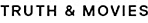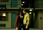
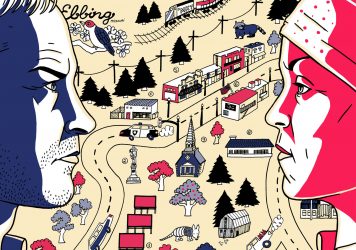
“What’s the law on what ya can and can’t say on a billboard?” When Mildred Hayes (Frances McDormand) decides to recycle some local ad space, she’s very particular about her words. She abides by the law, doesn’t use any defamatory language and, as intended, delivers a provocative message which cuts straight to the heart of the small town of Ebbing, Missouri.
The first sign, which reads ‘RAPED WHILE DYING’, is striking enough, but what makes it even more so is how it is written. The violence of the acts carried out against Mildred’s daughter is reflected in the colour of the boards, but the words themselves wouldn’t have the same effect if they were written in Futura or Comic Sans.Typography is a vital component of writer/director Martin McDonagh’s film, and there’s only one font that is bold and in-your-face enough for Mildred’s cause.
Designed by Geoffrey Lee in 1965, Impact was one of the last typefaces that the Stephenson Blake foundry in Sheffield made from metal. An alphabet forged in flame, for a time when words that were shared weren’t so easily removed, seems entirely appropriate for a ferocious wordsmith like Mildred Hayes. Lee, an advertising director, set about designing a font that got “as much ink on paper as possible in a given size”, ideal for advertisers getting their money’s worth (or in its predominant 21st century usage, ideal for giving text on memes clarity). Whether this is Mildred’s doing, or the work of Ebbing Avenue’s resident ad man Red Welby (Caleb Landry Jones), the billboards share her voice.
Just as Mildred’s overalls and headscarf are a key part of her character, so her choice of typeface tells us something about her personality. Impact is the kind of font that makes every sentence feel like it ends with an exclamation mark. The ascending and descending points are squat; rather than strolling with you into the next letter, the short, sharp kick of the Ls leave a bruise. The condensed letters and thick strokes are quicker and easier to read than a wider typeface; ideal for someone wanting to get a message across to the maximum number of people in the most direct way possible.
Mildred is not a big woman, yet in every interaction with her fellow Ebbing residents she cuts an intimidating figure, and this powerful economy of scale extends to her billboards. Despite Geoffrey Lee’s desire for his font to cover pages, on these three billboards they don’t need to because the words and simple presentation make them transcend their frame. Mildred wants people to take notice, and with the help of Impact, she certainly does that.
Published 10 Jan 2018
Our latest print issue offers a sweary salute to Martin McDonagh’s sensational latest.
Typography titan Dan Perri discusses some of his most iconic designs – from Raging Bull to Star Wars.
The British writer/director extols the many virtues of the star of his new film, Three Billboards Outside Ebbing, Missouri.


Little White Lies was established in 2005 as a bi-monthly print magazine committed to championing great movies and the talented people who make them. Combining cutting-edge design, illustration and journalism, we’ve been described as being “at the vanguard of the independent publishing movement.” Our reviews feature a unique tripartite ranking system that captures the different aspects of the movie-going experience. We believe in Truth & Movies.