In 1895, French film pioneers Auguste and Louis Lumière premiered a 45-second silent picture called L’Arroseur Arrosé. It was a watershed moment in cinema history in more ways than one. Not only was this the first film with a fictional narrative, and the first to portray slapstick comedy, it was also the subject of the first ever film poster. It’s nothing elaborate – just a small, giddy audience watching on as the projector beams a comedic scene onto the screen. It doesn’t even bear the name of the film. Nonetheless, this early poster set a precedent for the way moving pictures were marketed to the public which still, in one form or another, exists today.
Back in April, Marvel Studios released the latest one-sheet for Ant-Man and the Wasp. It’s a bold, brash explosion of big names, floating heads and elaborate patterns. Without wanting to understate things, it’s fair to say that L’Arroseur Arrosé doesn’t have much in common with Ant-Man. Among the many dissimilarities between the two posters, however, perhaps the most striking difference is that, where the latter is a composite of heavily-edited photographs of the film’s cast, the former has been drawn and coloured entirely by hand.
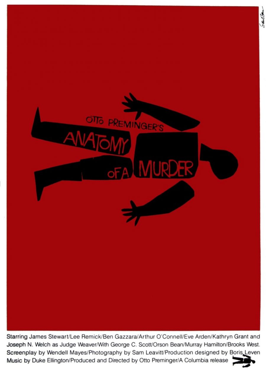
And that’s how it always was, once upon a time. From the 19th century until the tail end of the 20th, individual illustrators were largely responsible for luring audiences into the cinema. The earliest examples, like L’Arroseur Arrosé, portrayed scenes from the movies themselves. Soon, with the advent of the movie star, posters began to placing lead actors – the likes of Charlie Chaplins, Boris Karloff and the Marx brothers – front and centre. As the industry grew, however, artists began to take risks. By the 1950s and into the ’60s, Hollywood producers and marketers began allowing for a more abstract form of expression by artists, led by innovators such as Saul Bass (whose designs for Vertigo and Anatomy of a Murder are among the most remarkable of the era).
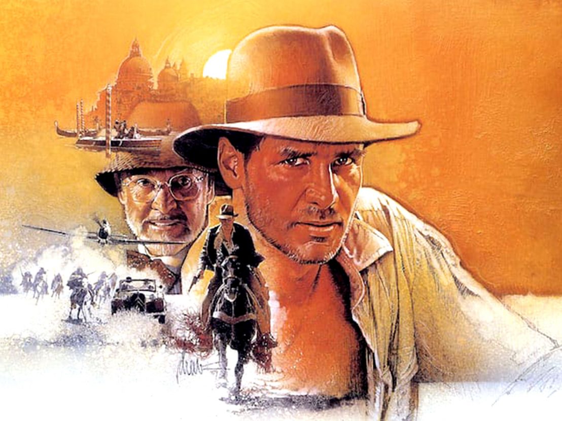
Undoubtedly, though, the Golden Age of Hollywood illustration was the ’70s and ’80s. The artists who thrived in that period created some of the most iconic posters in cinema history: the late Bill Gold with A Clockwork Orange, Richard Amsel with Raiders of the Lost Ark, Bob Peak with Apocalypse Now, Drew Struzan with virtually everything he turned his hand to. It was a time when the tools with which studios sold their movies stood as much chance of lasting through the ages as the movies did themselves. They were artworks – painstakingly crafted, highly atmospheric and, aesthetically, nothing short of beautiful.
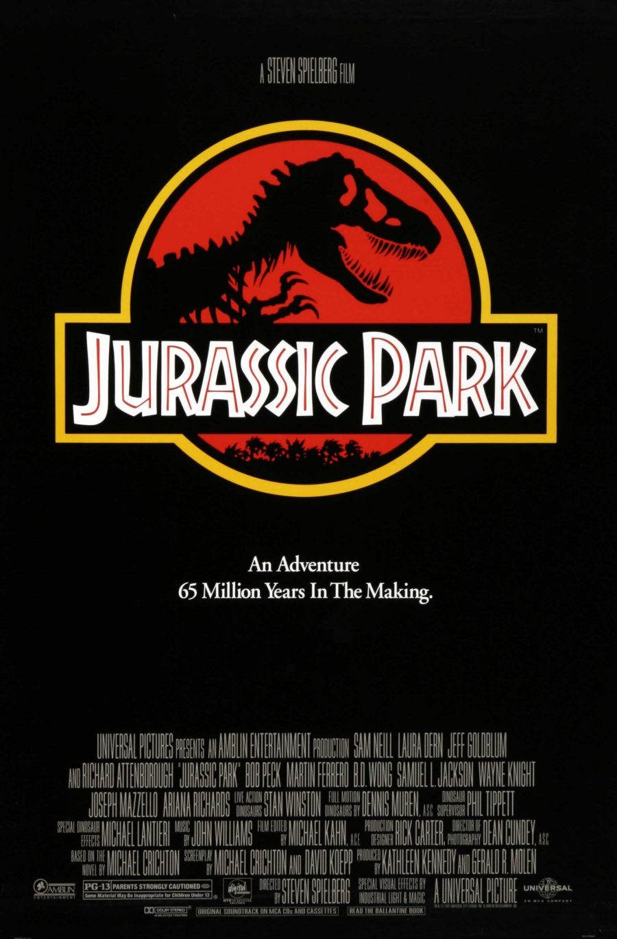
That all changed with the emergence of photographic posters, which heralded a seismic change in the way movies were sold to the public. By the beginning of the 21st century, many posters consisted of no more than a series of Photoshopped images of various cast members overlaid onto generic backdrops. Soon enough, clichés began to appear. The well of creativity dried up. Occasional flashes of brilliance – such as Jurassic Park or Fear and Loathing in Las Vegas – were becoming increasingly rare.
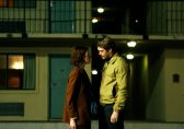
But why did the shift occur? Rory Kurtz, a Chicago-based artist who has illustrated the official posters for a number of recent releases, such as Baby Driver, Captain America: The First Avenger and Drive, offers his take. “It started with the advent of video stores in the ’80s, and the need that came with them to focus on big name actors to move home videos. And then photo editing software evolved over the decades that followed, allowing all sorts of attractive, photo-based possibilities.”
According to poster designer Dan Mumford, who has most recently worked with Disney, Marvel and DC, it was the need to adhere to budgetary concerns and mass appeal that drove Hollywood towards photographic posters. “It was simply the way things were done in the 1990s and early 2000s. Movie posters mainly consisted of photos and text. It was the look, and that was what appealed then.”
As Hollywood entered a new century, a new norm was swiftly established. Photography, which had made its usefulness known during the ’90s, became the go-to medium for poster designers. The reason movie posters have gradually become so formulaic is the same reason studios rarely hire illustrators who draw by hand: in a world where marketing a film can cost hundreds of millions of dollars, producing something risky or innovative simply isn’t necessary enough warrant the cost and effort.
A great illustrated poster offers something no photographic collage can match. According to Kurtz, hand-drawn illustration can “add a mood or a texture that isn’t easily accomplished with photo editing,” while even “stylistic and abstract posters can pick curiosity the way literal photography can’t.” Not that we should dismiss the digital poster entirely. As Kurtz explains, “it’s just a matter of pairing the right approach to the right film.” But even the most effective photographic posters (think Moon or The Master) hark back to the one-sheets of old.
Nostalgia is undoubtedly a key factor in the recent resurgence of traditional illustrated posters. Many of the hand-drawn posters we see today are designed to evoke the past (which typically means the 1980s). Take a look at the promo posters for Stranger Things, or the one-sheet for Ready Player One – they’re pure Struzan. In this sense, our shared nostalgia for the past has done wonders for the pen and pencil, even if it hasn’t driven any real innovation as far as design goes. For that, we must look elsewhere.
According to Mumford, “We now have this culture of alternative posters, and collectors who spend huge amounts on items that exist in small editions.” IMAX release alternate posters for Star Wars (designed by Mumford himself); fan artists design minimalist pieces for classic films which become hugely popular on the internet; Struzan even comes out of retirement to design a collectors’ piece for D23. Suddenly, style is cool again – and Hollywood has taken notice.
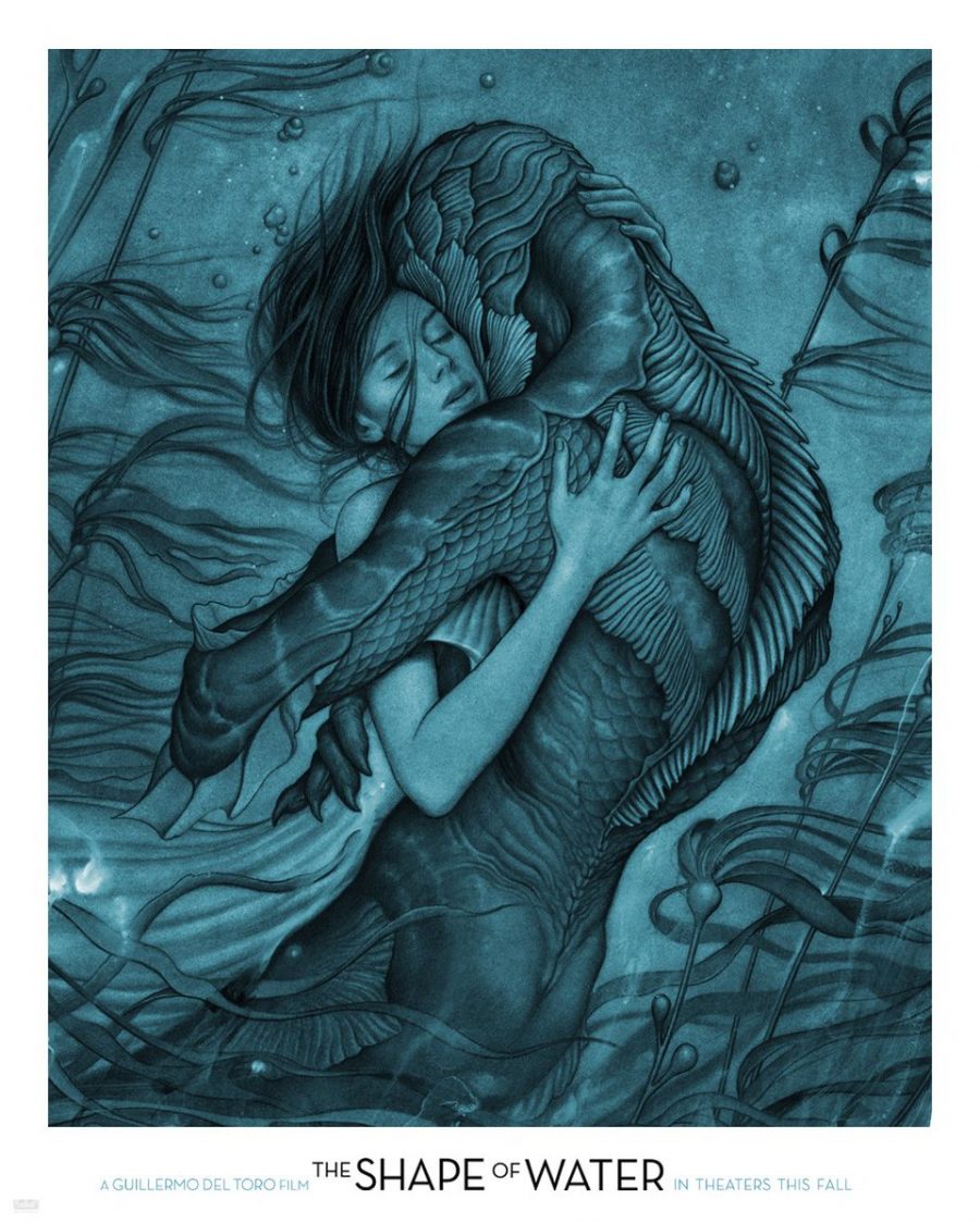
James Jean’s recent posters for Mother! and The Shape of Water, Mumford adds, marked a new watershed for the industry. “These movie poster collectors and creators got to see the sort of artwork they love up on the side of a bus or a billboard. It was quite special, in a way, and the positive impact of that is yet to be seen.” Traditional illustration is finally seeing a return to the mainstream, but while studios have begun to recognise the lasting impact that hand-drawn techniques can have on a film’s image, the future – and L’Arroseur Arrosé’s beautiful legacy – is far from assured.
Published 22 May 2018

A selection of iconic film art from the slacker generation.
Incredible original designs created for Ridley Scott’s iconic sci-fi horror.
Typography titan Dan Perri discusses some of his most iconic designs – from Raging Bull to Star Wars.


Little White Lies was established in 2005 as a bi-monthly print magazine committed to championing great movies and the talented people who make them. Combining cutting-edge design, illustration and journalism, we’ve been described as being “at the vanguard of the independent publishing movement.” Our reviews feature a unique tripartite ranking system that captures the different aspects of the movie-going experience. We believe in Truth & Movies.