In a new series, we’re celebrating the films we loved that aren’t likely to dominate the awards race. Over the new few weeks, our writers make passionate arguments for the performances and craft that stood out to them, from blockbusters to arthouse and everything in between.
When Reeves’ noir take on the Caped Crusader exploded onto the silver screen with a title card so strikingly gargantuan and vivid in red, its image replayed in my mind long after the credits had rolled. This daring entrance acts not just as a precursor to the movie itself, but also as a symbol to the bold visual creativity that drives the entire film. It can often feel like artistic verve is absent from the homogeneity of the comic-book genre – yet here Reeves’ and Director of Photography, Greig Fraser, utilise a distinct visual design for the camera that fulfills character, atmosphere, and emotion. It isn’t just the work that warrants recognition, but also the team’s innovative and unorthodox approach to realising it.
Inspired by the aesthetic of 70’s thrillers such as Klute and All The President’s Men, Reeves and his team chose to use older anamorphic lenses synonymous with this bygone era of filmmaking. Despite being technically defective by today’s standards, Reeves and Fraser loved the imperfect beauty of these “broken” lenses; namely the murky deep bokeh and focus fall-off that occurred towards the edges of the frame. Whether or not these details are perceptible to the average eye, their visceral quality transcends our own technical knowledge of photography, and evokes a cinematic vocabulary that we subconsciously understand.
In the film’s opening monologue, as a masked Bruce Wayne drifts through the Halloween revellers of a rain-soaked Gotham, the crowd and the city’s peripherals blur around the protagonist. The filmmakers manipulate the distorted element of their lens to their advantage, pulling the audience away from the costumed chaos and into Bruce’s own singular point of view. It enables us to see the world through his nocturnal eyes, and reminds us that the best cinematography almost always serves the story.
Fraser and co. didn’t stop there, and in order to complete their 70’s aesthetic they took extreme measures to recreate that iconic celluloid look found only on film stock. Not only does it unify their visual palette with vintage continuity, but digital was viewed as “too clean” for their gritty narrative of crime and corruption, so film’s intrinsic grain added this tangible sense of hard-boiled spirit to The Batman.
But loads of contemporary filmmakers still shoot on film – what makes this any different, you might ask? Well for starters, they didn’t shoot on film – The Batman was shot digitally. In a story primarily operating within the dark shadows of Gotham’s underbelly, shooting digitally on the ARRI Alexa-LF became a necessary requirement to capture such low-light environments. Nevertheless, Reeves still didn’t want to compensate on his vision, and in order to obtain a film emulsion beyond digital emulation, colourist David Cole had the finished footage exposed onto the film negative itself. Not once, not twice, but several times; creating a truly authentic texture that elevates the final film. Now if that’s not dedication to the cinematic experience, what is?
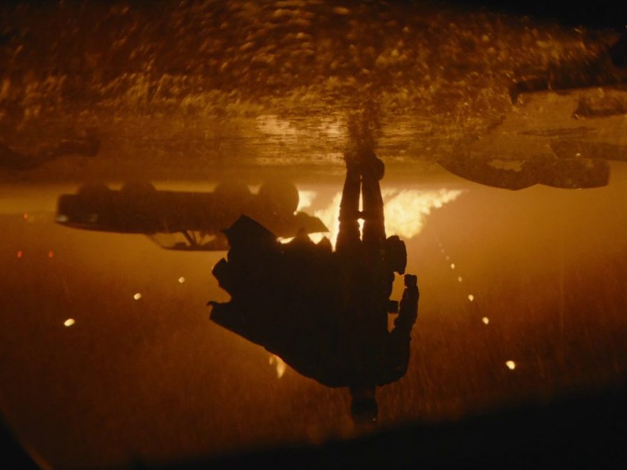
The cinematography of Reeves’ adaptation also exists in a heightened reality; one where the creative design will happily delve into the theatrical, whilst always being grounded by some form of realism that makes it accessible. One of the film’s most exhilarating sequences is the batmobile highway chase – a set piece fuelled by burnt rubber and bullets, but one equally memorable for its evocative lighting. A wash of warm sodium street light illuminates the scene, which paints the vehicular pursuit with a fiery hue that ignites the action. Yet, despite the dramatic lighting, pragmatic framing steers it away from total surrealism. The camera is locked onto the cars with hard mounts, embodying their unique point of view and in turn positioning the viewer directly into the experience. We’re right there, hurtling through traffic and holding on for dear life, courtesy of Fraser’s calculated composition and the crew that implement it.
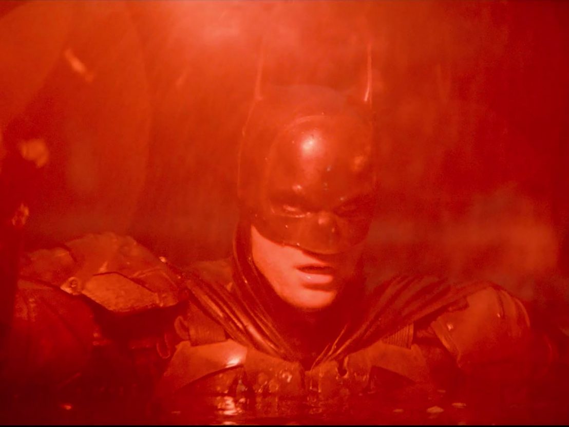
The graphic power of The Batman’s cinematography is perhaps best expressed towards the latter half of its grand finale. After an explosive takedown of the Riddler’s army up in the rafters of Gotham Square Garden, Batman descends the flooded stadium to find himself submerged by water and total darkness. Producing a flare that engulfs our hero in a loud red and guides the citizens of Gotham to safety, the shot has already become a part of the character’s rich iconography. The expressionistic colour – a recurrent motif of the film – imbues Robert Pattinson’s performance with mythic weight that resonates emotionally.
Upon entering the Iceberg Lounge in the first act, the club’s crimson lights dramatically herald Bruce’s penchant for vengeance, yet by the film’s climax, the colour red is now emblematic of Batman’s capacity for hope. Across the entire runtime, whether it be low-angle shots of Batman’s boots stomping into the omnipresent rain or close-ups of Pattinson’s eyes baring Bruce’s soul to the lens, Fraser makes sure to consistently deliver on a deeply intuitive level. You don’t just see The Batman – you feel it.
Published 20 Jan 2023
Robert Pattinson’s grunge prince vows to wash the scum off Gotham’s streets in Matt Reeves’ noirish detective thriller.
By Greg Evans
How an animated TV movie from 1993 cut to the dark heart of DC’s iconic antihero.
By Greg Evans
Way before the Dark Knight got serious, he was thwacking bad guys and dismantling bombs in a slapstick ’60s family film.