LWLies’ artistic director, Timba Smits, discusses the fine art of drawing portraits ahead of his new solo show, Role Models.
The first Bill Murray film I saw was Ghostbusters. I saw it on VHS. My Dad brought it back from one of his overseas trips, so I never got to see it at the cinema. It must’ve been about 1987. I would have been eight, my older brother would have been 10. I distinctly remember Bill Murray being the funny guy. He went on to become one of my favourite actors of all time.
Yet I never remember actively going out there and looking for other Bill Murray movies. That goes for any actor that I admire. Their roles will just come to me when they come to me. This way, I have managed to steer clear of the ones that people have said aren’t so good. I mean, I love him in all of the Wes Anderson films. Yet, if I was to think of my least favourite Bill Murray performance, I can’t say that anything instantly springs to mind. I haven’t seen Larger Than Life. Or Garfield. I have managed to avoid the asteroids. The Bill Murray asteroids.
In one of my favourite roles of his, you don’t even see him on screen. It’s the badger from Fantastic Mr Fox. And I saw the Jungle Book, and he is fantastic as the voice of Baloo. He’s just got that persona. You don’t even have to see Bill Murray. It’s just his voice and his style of comedy that grabs you.
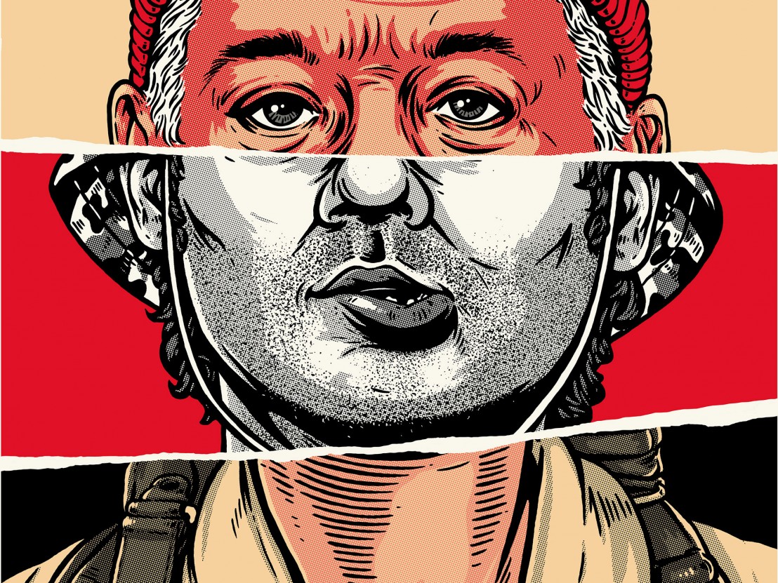
Drawing a portrait of Bill Murray is interesting. After showing my girlfriend one of my recently finished portraits she was like, “Wow that really looks like Bill Murray!” I said to her, “Yeah, well it’s pretty hard to fuck up Bill Murray”. His face is just so full of character. You can easily mask off three quarters of his face and you just know it’s Bill Murray. His eyes especially.
When I’m creating a new portrait it’s really important that you connect with the subject. I always start with the eyes. From there, you start to build up a likeness. For me, the Steve Zissou role is a great reference of this because of his wild facial expressions. In that one scene where he screams, “Esteban was eaten!” and he’s got those crazy eyes. I sometimes like to think he was picked for that role just because of his great eyes.
From the point of view of the series featured in this show, and the fact that the artwork consists of three tiers, I carefully chose the Bill Murray characters I love the most and then dissected down each iconic expression. Which section is going to be the strongest? In my view, the eyes needed to be Steve Zissou. And then the middle section is Carl Spackler (Caddy Shack), obviously the most iconic part of his face in that film is his stupid lips. And then the bottom section of that artwork is the famous Ghostbusters uniform with the big patch saying ‘Venkman’.
Every new artwork starts with blue line sketches, and I just roughly create my composition and likeness. This gives you a map to work from as you start inking plus it’s easy to get rid of once you scan your drawing and bring it into PhotoShop. You simply adjust your black and white levels, and the blues just disappear. You could say it’s an old technique, quite common with cartoonists, animators and graphic novel artists. They will draw everything in blue pencil and then go over it with ink and colour. If you look at old comics you can see a lot of the blue pencil marks still there. Plus for some reason, the blue pencil lead just makes you draw better. The softer lead makes the process more fluid.
When it comes to sketches I work fairly quickly. I’d say a couple of hours for that stage knowing I can improve things as I go. In the beginning more time is dedicated to researching and putting together an amalgamated mock up using found photographs. So I might find some images of Bill Murray where his ears aren’t quite natural or as I’d want them, so i’ll cut his ears from one photo and put them onto another. I work a bit like a collage artist in that sense. I will use that as my reference point to create my blue line sketches. Then we start getting into inking, which is more labour intensive and challenging.

When I’m working on a series like I have been for Role Models, I’ve got 10 artworks on the go at one time. So I will start one, and instead of finishing that and moving on to the next one I’ll jump around. So if I get tired of drawing Bill Murray for a bit, I’ll jump over to Tom Hanks or Mike Myers just to keep things exciting. Also when I’m working on one, I might discover something in the process that influences the others so I’ll go back to them and make improvements. That’s an ‘exquisite corpse’ way of working in itself.
I have a habit of fussing over things way too much, so with this show it’s been great because I’ve got a very specific deadline, a tight deadline that I’m working towards. I’ve been working on it for some time, but the show is fast approaching now and I’ve still got pieces to finish. I’ve accepted that they are probably never going to be finished how I want them to be, but that would probably wouldn’t happen even after another two years worth of fussing over them. And that’s just not productive. I’ve done some test prints and they look really great and I’m excited to see them up on the wall as a collection. But it’s definitely good to have a cut off point.
Role Models opens at the Lamington Drive Gallery on 18 May and runs until 11 June, and then in London on 18 August. For more info head to timbasmits.com
Published 9 May 2016

Pick up our latest issue and fall in love with Todd Haynes’ breathtaking period romance.

The great Guillermo del Toro talks about his magnificent Gothic ghost story.

By Matt Thrift
A collection of 60 unforgettable declarations of love from the movies to get you in the mood this Valentine’s Day.